THE STORY:
Owasso Sew Co. was founded by my mother, a talented seamstress passionate about creating practical, handmade items. The rebrand celebrates her legacy while embracing a fresh direction: eco-friendly products designed for today’s lifestyle. The brand’s identity now reflects its local roots and dedication to sustainable and personality, appealing to the next generation of customers.
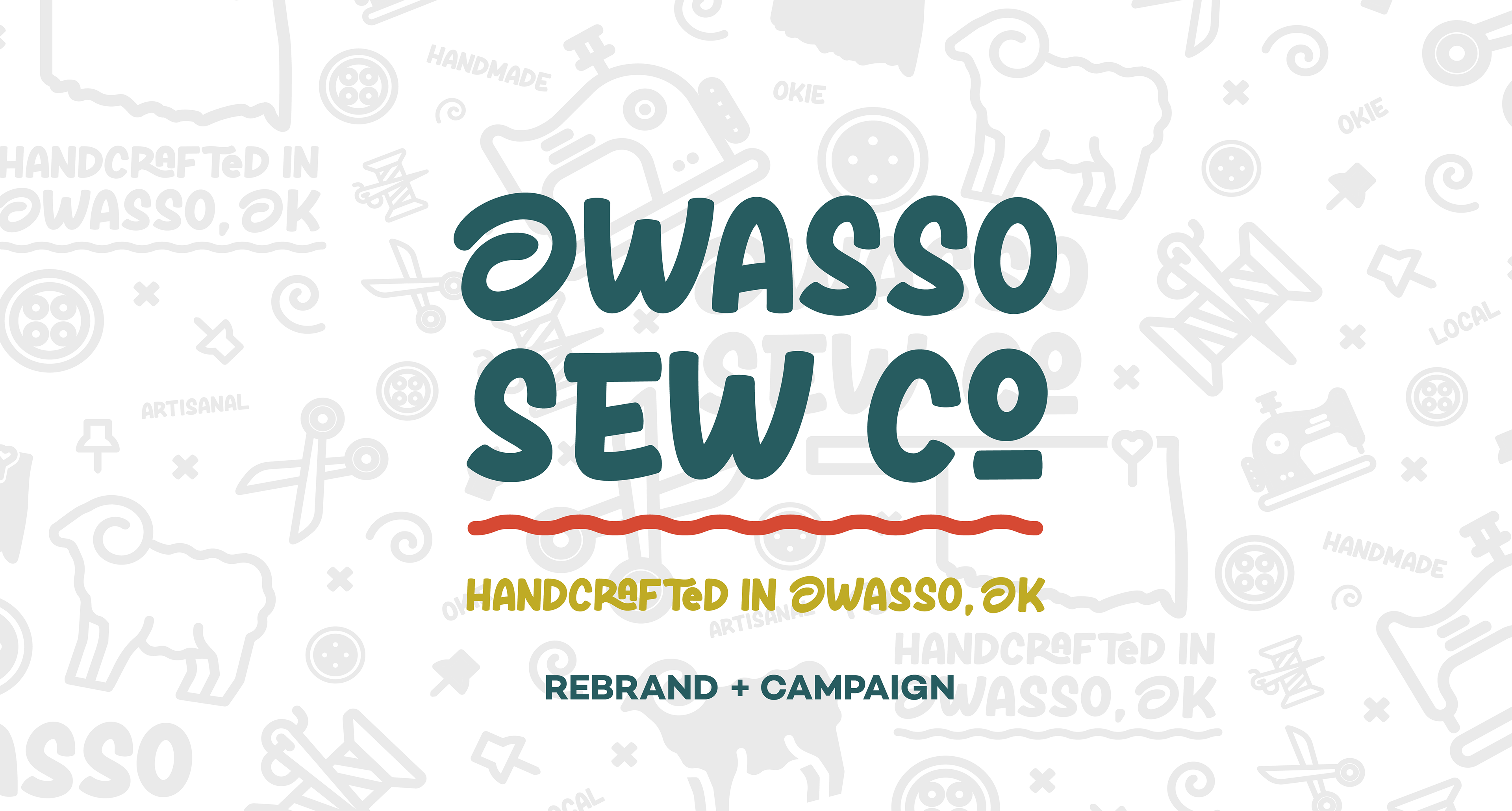
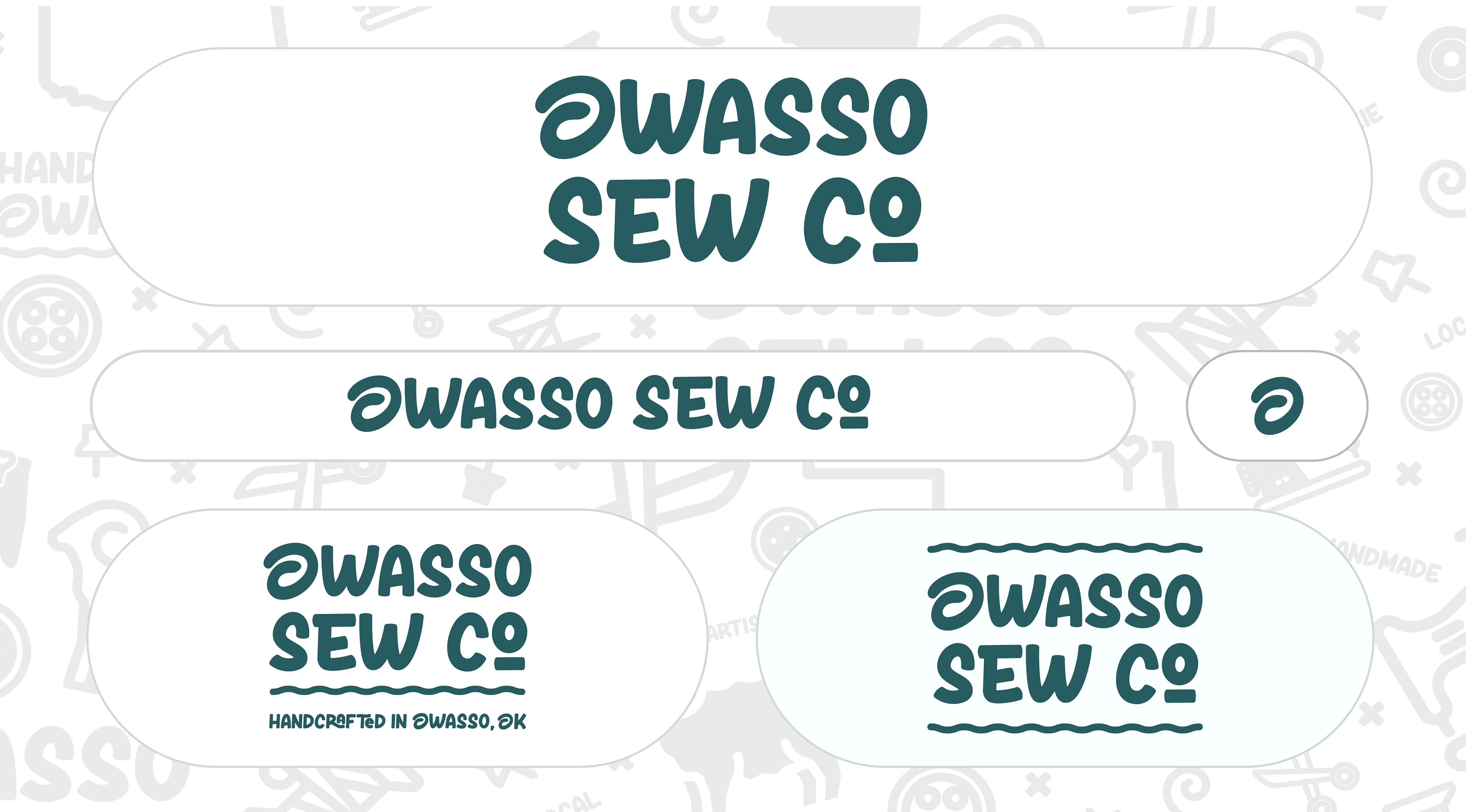
THE LOGO:
For the new logo, I leaned into the charm of her original small-town roots while modernizing it with a clean, playful aesthetic. The ram icon is a nod to the mascot of Owasso (fun fact: Owasso means “end of the trail” in Cherokee), and the color palette combines a funky, mid-century feel with clean, cool tones that ground the brand in its eco-conscious mission. I paired this with fun, modern typography that feels fresh but timeless—like something you’d see on your favorite reusable tote.
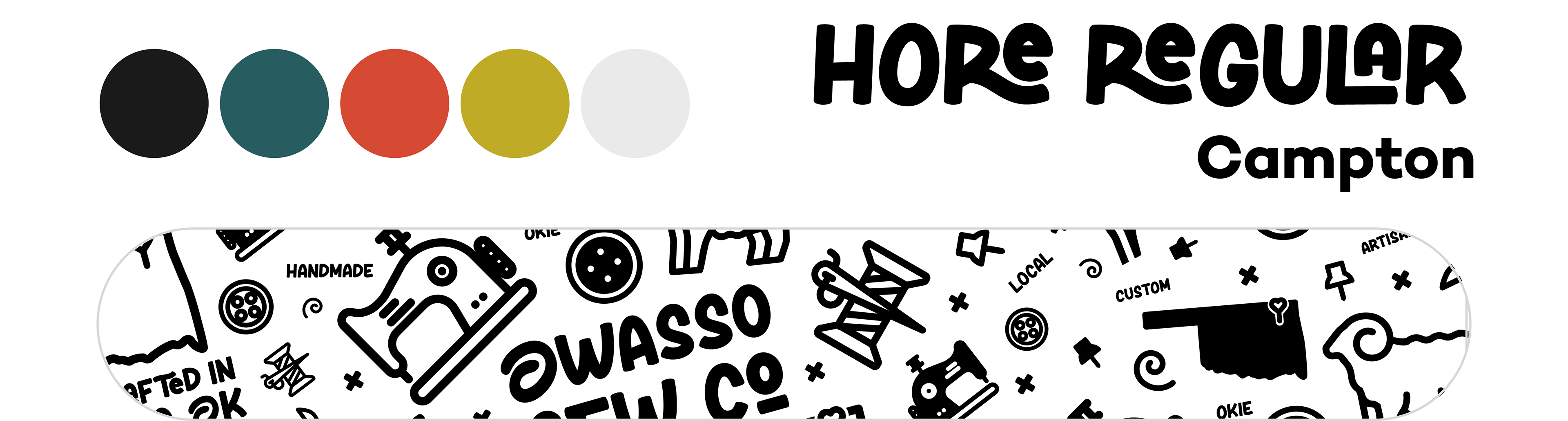
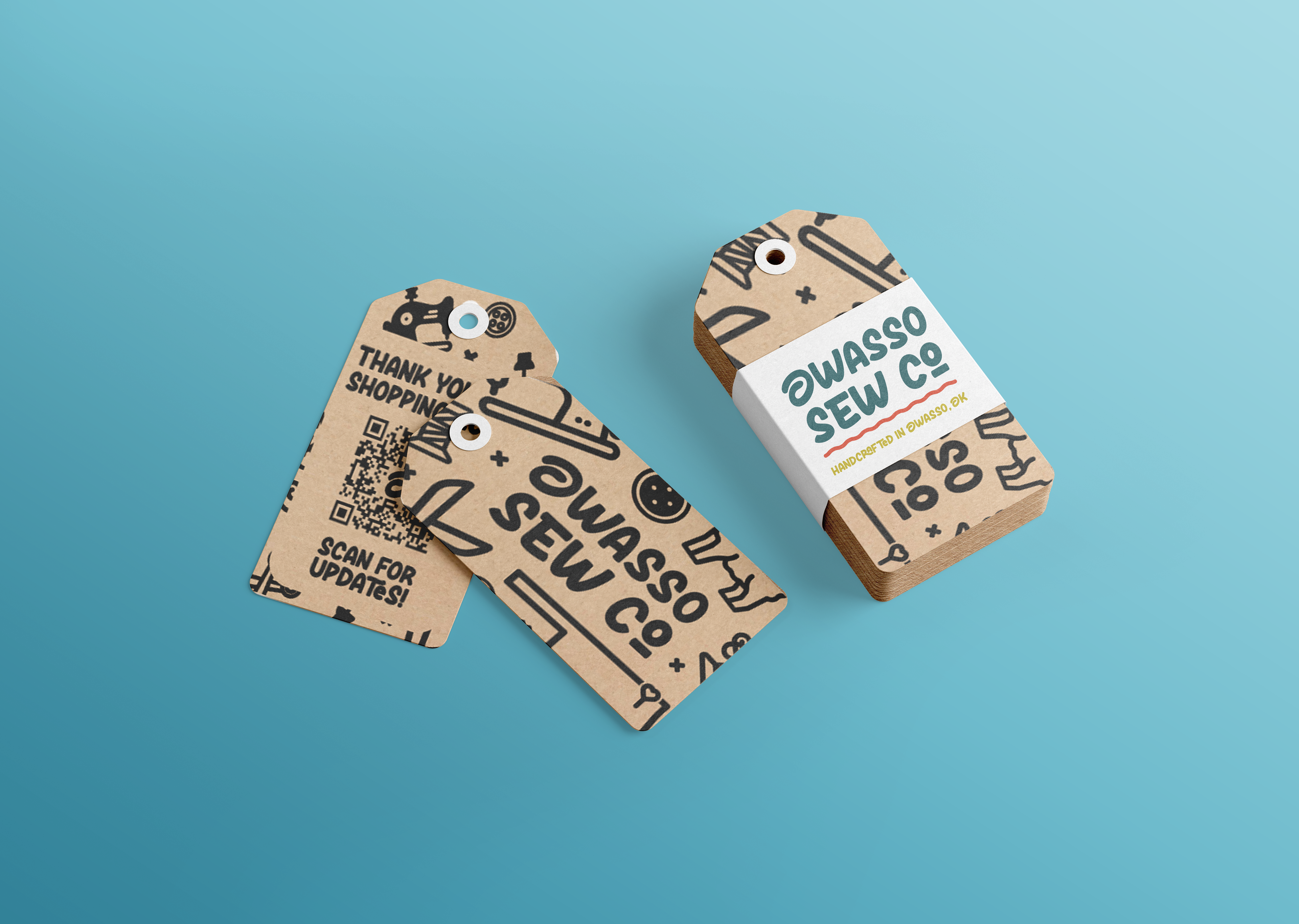
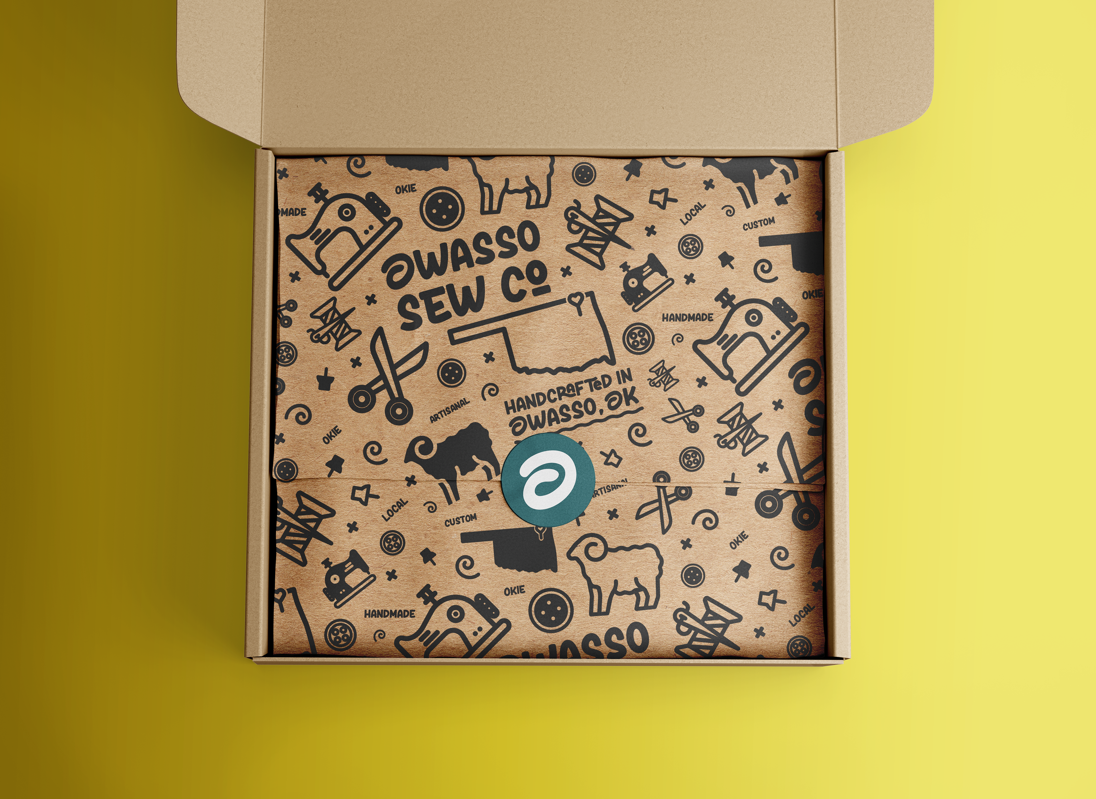
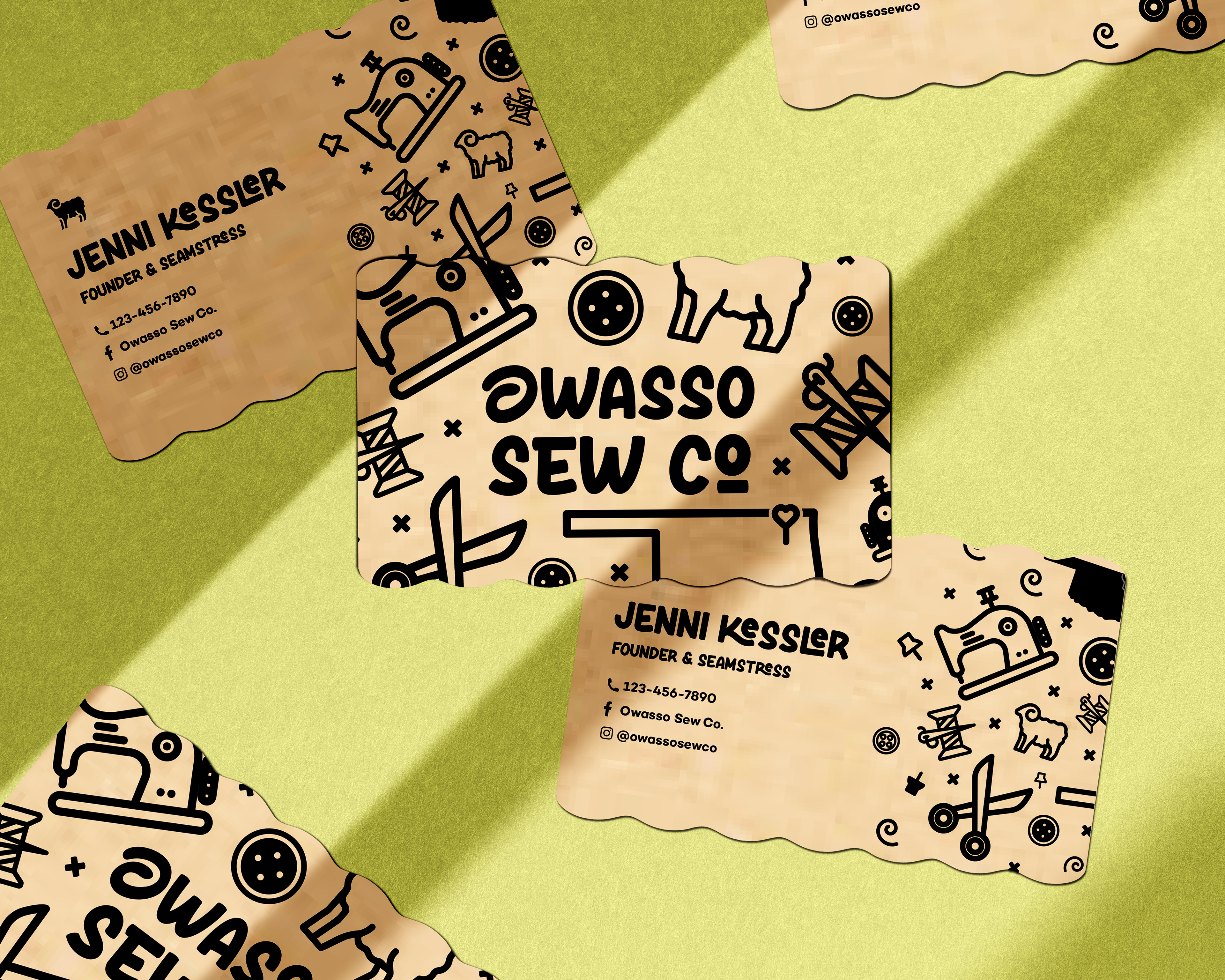
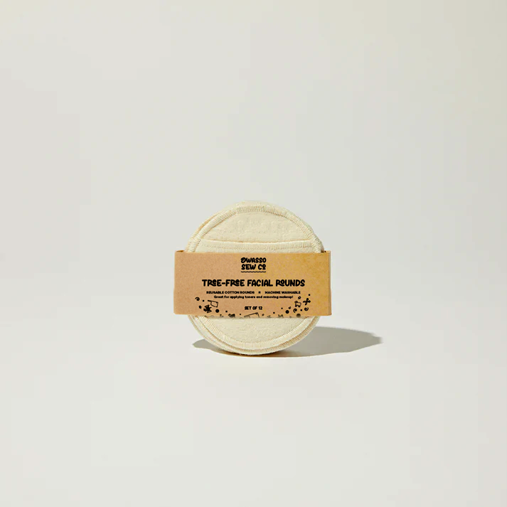
PACKAGING AND IDENTITY:
Using the pattern, type, colors, and logo I pre-established, I began to work on new packaging and identity pieces, including shopping tags, business cards, and labels.
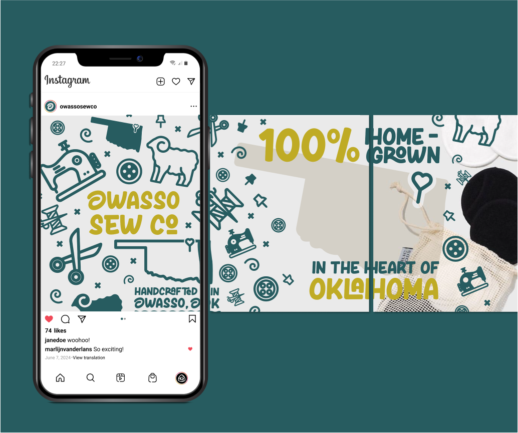
THE CAMPAIGN:
I wanted to launch a campaign surrounding the rebrand to the companies pre-existing audience to establish her new look and voice, here are some examples of a social media carousel and accompanying posts Owasso Sew Co.